
Thursday, 24 January 2013
School Magazine Front Cover

This is my final front cover for my School Magazine preliminary task. I made sure that I kept reffering back to my mock-up to make sure that the layout ended up how I initially wanted it to. I'm happy with mthe end result as it is eye-catching due to the bright colours I used, yet it stays with the theme of a school magazine.
Mock-Up of School Magazine Cover

Billboard Music Magazine Analysis
Masthead- The house style of Billboard magazine is centred on the masthead – sans serif font, with colours circles filling in the spaces of the letters. Similar to most magazines, the masthead doesn’t actually have to be seen completely for potential readers to know what magazine it is, due to the iconic masthead.
The covers are colourful and striking, and although the font and placement of the various cover lines changes throughout the different issues, the reader can clearly see that they are reading Billboard Magazine.
The main images that Billboard use of their covers often compliment the colour scheme used in that issue, or they match up to the font colour. For example on the Carly Rae Jepson cover, she is wearing red lipstick, which matches up to the red font used. Alternatively, on the Drake front cover, the photo is in black and white so the font matches this.


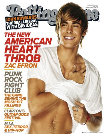
Rolling Stone Music Magazine Analysis

Main Cover line: “Justin Bieber Super boy” connotes that Justin is not an ordinary teenager in the sense that he is ‘super’ and capable of huge amounts of success. The font of the main cover line, and all the other cover lines, is sans serif, and in very bold colours of red and black, matching the masthead and keeping a theme running throughout the cover.
Cover line: “The clash: the secret history of punks greatest band” implies that there is something scandalous that the public do not know about a band they have been fans of for a long time. This cover line is intriguing and would probably encourage potential readers to buy the magazine.
Main image: The main image of Justin Bieber is made to make him look quite rough and edgy, as if he is care-free and shows an unusually rebellious side to the teen singer.


Subscribe to:
Comments (Atom)